Ever wonder why your website looks amazing, but it doesn’t bring in customers? You’re not alone. Many Montréal businesses invest in sleek, stylish sites that win design awards but lose real-world conversions. The truth is, great design isn’t just about how your site looks, it’s about how it works.
According to a study, effective UI may boost conversion rates by up to 200%, and effective UX can do the same, by up to 400%. One of the easiest KPIs to measure is conversion rate, which enables you to calculate the revenue boost that UI/UX creativity can produce.
GeeksforGeeks.org Tweet
But, being expert designers, we already knew this. Beautiful design should also convert. In this guide, we’ll reveal the hidden UI/UX design mistakes that silently kill conversions, and show you exactly how our design experts fix them.
If your website looks great but isn’t generating results, it’s time to rethink your approach.
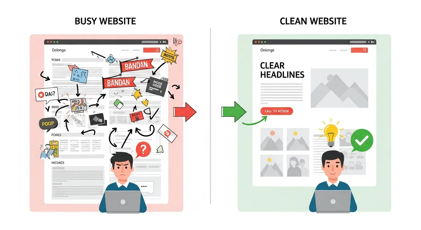
Design Mistake #1: Trying to Impress Instead of Guide
You’ve seen it before… A homepage full of movement, autoplay videos, flashing banners, and ten different calls to action fighting for attention. It’s easy to fall into the trap of wanting your website to wow visitors, but here’s the truth: when everything stands out, nothing stands out without a design strategy.
Your visitors are there to find answers, make decisions, and take action. A well-designed website design should guide users smoothly toward their goal.
How We Improve This: Simplify your layout. Keep one clear goal per page. Use visual hierarchy, larger headlines, whitespace, and consistent color contrast, to direct attention where it belongs: your “Book Now” or “Contact Us” button.
Mistake #2: Ignoring Page Load Speed and Performance
A slow website is a silent deal-breaker. Studies show that every 1-second delay in load time can reduce conversions by 7%, and most users will leave if your site takes longer than three seconds to appear. No matter how beautiful your design is, it won’t matter if people never see it.
Common culprits? Oversized images, heavy animations, too many plugins, and low-cost hosting. Montréal websites often include bilingual content and larger asset libraries, which makes optimization even more important.
At Exatech Design, our developers don’t just design for looks; we engineer for speed and SEO performance. We compress visuals, streamline code, and balance functionality with fluid performance across all devices.
How We Improve This: Use CDN caching, optimize every image before upload, minimize plugins, and always test on mobile.
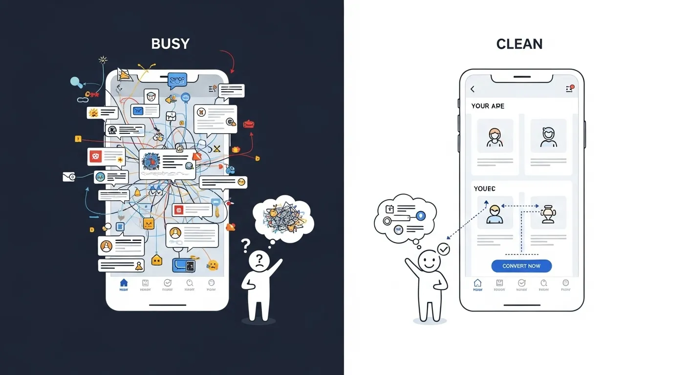
Design Mistake #3: Confusing Navigation and Poor Page Flow
Your visitors shouldn’t need a map to move through your website. When navigation is messy, inconsistent, or overloaded with options, users experience what we call cognitive friction. Cognitive friction is the mental strain of figuring out where to go next. And when people have to think too hard online, they leave.
Endless dropdowns, dead-end links, or vague menu names (“Solutions,” “Products,” “More”) make users feel lost. A confusing journey breaks trust and kills conversions.
The best websites are effortless to use. They lead visitors step by step toward action with clear structure and familiar flow.
How We Improve This:
- Keep navigation simple with 5–7 top-level links.
- Group pages logically: Home – Services – Portfolio – Contact.
- Use descriptive labels that match how real people search, not internal jargon.
At Exatech Design, we build Montréal websites that feel intuitive from the first click. Because when navigation feels easy, conversions happen naturally.
Design Mistake #4: Poor Mobile Experience
In today’s world, your first impression rarely happens on a laptop. Most Montréal users will visit your website from their phone while commuting, standing in line, or scrolling late at night.
If your site isn’t optimized for mobile, those potential customers are gone in seconds.
Common red flags? Here are a few:
- Text that’s too small to read.
- Buttons that are impossible to tap without zooming.
- Pages that scroll sideways.
Even one of these creates friction. At Exatech Design, we design with a mobile-first mindset. That means starting from the smallest screen up, ensuring every touch, swipe, and scroll feels effortless. We build fluid layouts that adapt beautifully across devices, so your message stays clear and clickable everywhere.
How We Improve This:
- Use mobile-first layouts that load fast and scale gracefully.
- Design larger touch targets and declutter the screen.
- Keep forms short. The fewer fields, the higher the completion rate.
Design Mistake #5: Forgetting to Build Trust
Design brings people in, but trust keeps them there. Without visible credibility, even the most beautiful website feels risky to new visitors.
Missing testimonials, vague contact details, or generic stock photos make users hesitate. In a city as relationship-driven as Montréal, that hesitation costs conversions.
Trust is built visually and verbally. A single customer quote in French and English, a local partnership badge, or a few Google review stars can immediately validate your business.
Exatech Design helps Montréal brands weave credibility into their design to enhance trust and support long term business growth. We design “trust sections” that highlight your real clients, certifications, and community ties, so visitors feel confident taking the next step.
How We Improve This:
- Add social proof (Google reviews, partner logos, badges).
- Include bilingual testimonials to connect with Montréal’s diverse audience.
- Feature at least one authentic client quote with a face or company name.
Design Mistake #6: Vague or Passive Calls to Action
Your visitors might like your website, but without a clear next step, they’ll leave without acting.
Buttons that say “Learn More” or “Submit” don’t inspire confidence or excitement; they create uncertainty. People hesitate when they don’t know what happens next.
The solution is clarity and intent. Your CTA should tell users exactly what to expect and why it’s worth clicking. Every page should move visitors one step closer to contacting you, not leave them wandering.
At Exatech Design, we treat every CTA as a micro-conversion moment, a chance to build momentum and reduce doubt.
How We Improve This:
- Use verbs + value, e.g., “Book My Free Design Audit” or “Get a Website That Converts.”
- Place CTAs above the fold, in section breaks, and at the bottom of long pages.
- Keep button styles consistent across your entire site.
Design Mistake #7: Ignoring Data and User Feedback
Design without data is guesswork, and guesswork is expensive.
Many businesses redesign based on instinct (“I just want it to look cleaner”) rather than user behavior. The result? A prettier website that still doesn’t perform.
Real UX success comes from listening to your users. Tools like Hotjar, Google Analytics 4, and Search Console can show you exactly where visitors click, scroll, or drop off.
When you know what’s working and what isn’t, you can make changes that actually move the needle.
At Exatech Design, we blend creative insight with measurable performance data. We don’t just guess what your users want. We put ourselves in their shoes, so we can see it.
How We Improve This:
- Review heatmaps to identify friction zones.
- Use A/B testing before major design updates.
- Track conversion funnels to measure real progress.

5 Tips for Building a UX That Drives Conversions
The best user experiences don’t shout. When UX is done right, your visitors don’t notice the design at all; they simply act. They find what they need, trust your brand, and take the next step naturally.
At Exatech Design Montréal, we believe that great design is equal parts beauty, usability, and measurable growth.
Our process blends creative craftsmanship with real-world data, helping your brand convert more visitors without gimmicks or guesswork.
- Simplify the Journey: Remove unnecessary steps between discovery and action. Every extra click costs you potential customers.
- Prioritize Visual Hierarchy: Use color, contrast, and spacing to guide the eye toward key information and CTAs.
- Design Mobile-First: More than half of Montréal’s users browse on mobile. Build from the smallest screen up to ensure a seamless experience everywhere.
- Use Language That Inspires Confidence: From buttons to form labels, every word should reduce hesitation and make the next step feel safe and rewarding.
- Test, Measure, Improve: Use analytics and user feedback to refine continuously. Great UX isn’t built once. It evolves with your users.
Not Sure if Your Site Has Website UI/UX Design Mistakes That Kill Conversions? Schedule a Free Assessment Now!
Great design means nothing if your visitors get lost before they convert. Small UX issue can slow load times. Weak navigation and unclear calls to action can quietly drain revenue. Exatech Design Montréal specializes in finding and fixing those invisible barriers that stop your site from performing at the way it should for your business.
Schedule your free UI/UX assessment now and start converting smarter.